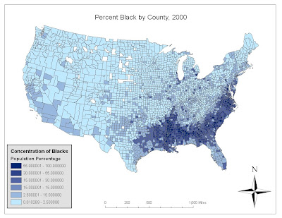
 This first map shows the concentration of African-American blacks throughout the United States. It is clear that blacks are most strongly concentrated in the southern United States such as Virginia, Alabama, Mississippi, Georgia, and Louisiana. Besides the south, we find that blacks are most concentrated in counties with large urban cities (i.e. Chicago, New York...) and their surrounding suburbs. This distribution seems to be an obvious result of Black America's history, from slavery in the South on to the relatively free movement of blacks into large cities, and the the eventual 'black flight' of many African Americans into the suburbs in the '60s.
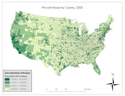
 This map shows the percent concentration of individuals identifying as any of many Asian ethnicities. Judging from the map, American Asians are predominantly focused in the more urban regions of the U.S. After some outside research I found that Los Angeles has the highest number of Asians, followed by New York, New Jersey and Long Island. Because the "Asian" racial category is so diverse, the disbursement must be based on many different factors. While the west coast hosts the highest percentages of Asian. Many Japanese and Chinese first settled in Hawaii, and then later worked as laborers on the transcontinental railroad, concentrated mostly in the West. They settled in the bay area and Los Angeles, establishing Japantowns and Chinatowns, and later Koreatowns and others, in regions of the cities and their suburbs.
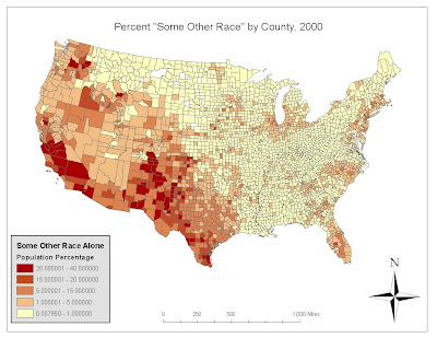
This map was the most interesting to work with. It shows the concentration of "Some Other Race" throughout the US. This is interesting to me because, at first, I was at a loss for what "Some Other Race" referred to. After a bit of outside research I learned that this category is held for those individuals who do not identify with any of the races presented on the census. Apparently, it was designed for those of mulatto or mestizo race, i.e. people of Hispanic or Latin American origin. Because it is not a specific category, other individuals may choose to select it, but in 2008, "15.0 million people, nearly 5% of the total U.S. population, were estimated to be "Some other race" with 95% of them being Hispanic or Latino" (Wikipedia.com) We find these people most concentrated in states bordering Mexico and on the (once Mexican) southern West Coast.
These three maps show the distribution of three main minorities in the US: African-Americans, Asian-Americans, and "Some Other Race," in this case primarily Hispanics and Latin Americans. Firstly, we can infer that these concentrations are founded on racial histories. Blacks are predominately reside in the south, where they were historically concentrated as slaves. Asians predominate the West Coast due to their work on the Trans-continental railroad. Hispanics and Latin Americans occupy border states and previously Mexican land. In addition to the historical factor of these distributions, each of these races has created appealing communities which attract more of the same race. Major cities throughout the US include suburbs populated primarily by specific races, i.e. Chinatowns, black suburbs, and Mexican-American communities. It was very interesting to work on these maps and interact with the data in order to watch these complementary racial distributions take shape on the screen. The visualization of these population distributions is important to understand what regions of the US are populated by who, why they might live there, and how this racial make-up might effect politics, economics, and education in different regions.
GIS is a very useful tool that I have become very interested in learning to use and apply to everyday happenings. I think that it is very important that people become comfortable comprehending spatial data and phenomena. Through GIS the general population might better understand what factors contribute to their own lives by being presented with not only the hard numbers but that data organized coherently and relatively on a map. The basics that I have learned in this class have strongly affected my conception of what is mappable, why different maps are made, and the power that presentation has on the effect of the map. Learning about different projections opened my eyes to the ease of misinterpreting space and relative size and distance, making me aware of the potential for misuse of maps. The software has really impressed me and I am excited to work with it in the future. It's clarity and ease of use does not do it's power and usability justice, and I am definitely excited to work with different data from all over the place.
No comments:
Post a Comment