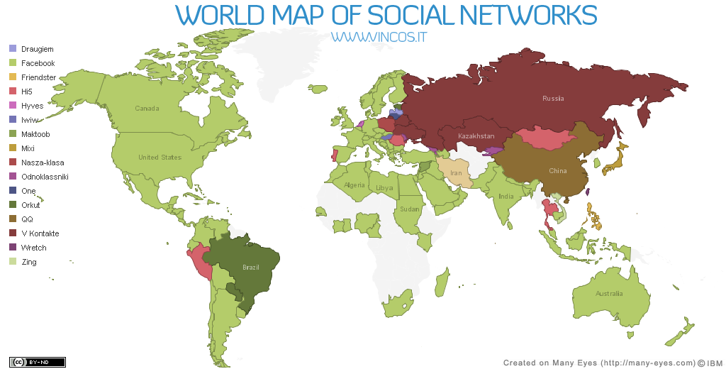
This map was derived from data gathered by Alexa and Google regarding worldwide website usage. This map shows the most popular online social networking sites by nation. I thought this map was interesting because it shows how much Facebook is now used around the world. I also think it's rather interesting how China has its own internal social network and that Russia and surrounding areas have adhered to their original russian networking sites. It will be interesting to watch how these major social networking patterns evolve around the globe.

This map is a representation of the US Interstate system presented like maps of the London Underground transit network. I like it because it represents these interstates merely as pathways across the country, disregarding geographic details. The extreme simplification of this transportation network clarifies it in a peculiarly efficient way.
![[la+parks+health+map.bmp]](https://blogger.googleusercontent.com/img/b/R29vZ2xl/AVvXsEiy111XbVxBZbAo__kS4NgO2A0UmAzj3GsfDonVNAIXNUIsSpZt7FNPs6lcP24HjxRY0iT97jAfJi9lR9AbRaCfo8ZPBHSt6XqXlpPsOENyk80UVH0nzi2NY_tMlXKR8OrZRHRph8CTsrAU/s1600/la+parks+health+map.bmp)
This map suggests a relationship between park density in LA (shades of green) and obesity rates in children (smaller circles indicate lower rates). Its interesting to note that there are several larger circles throughout the regiod regardless of public park density.
This fourth map, taken from googlemaps.com, shows Omaha, Nebraska, with surrounding cities and towns. I think maps like this are interesting because we can see the grid partitioning that went down throughout the Great Plains and Midwest. Even though the city has grown, the streets remain much according to the grid system.
I like your selection choices. Just think if the US did have a high speed train system like the second map! Also it would be interesting to see the parks/obesity map with the ethnic makeup of the areas displayed as well. Easily done with a GIS!
ReplyDelete10/10