Thursday, April 22, 2010

Lab 3


View Santa Barbara (Lab 3) in a larger map

Neogeography is a very interesting and exciting development. Now people are able to conceptualize and manipulate their own perceptions of their homes and cities and world as a whole. Thanks to the straightforward and accessible technologies presented to us now through sites like google maps, the common individual can now better understand their lives in a spatial context. However, the advantages of this new accessibility come along with some risks. While we are lucky to be able to overlap satellite imagery with road maps and other overlapping layers of information, we are still at risk of falling victim to construed projections, especially when looking at large areas of land. This might lead us to misinterpret the scale and relation of different landmasses or cities.

Another risk when dealing with this new mapping scenario is that information does not always match up. Since users are able to add and remove information as they see fit, there will usually be incomplete and biased points and areas of interest unofficially placed and possibly incorrectly and so not accurately representing the true location of an area or point. I know that in my map, the areas I designated as "downtown" and "goleta" and "montecito" were placed quite ambiguously and are meant only to provide an idea of the area. Neogeography seems to be building up off of legitimately survey mapping information and into a more variable and less absolute representation of not only a physical environment but a social and psychological web of overlapping paths, points, areas, and information that we can and should both learn from and analyze with caution.

Thursday, April 8, 2010

Lab 2

1. What is the name of the quadrangle?
This is the Beverley Hills quadrangle
2. What are the names of the adjacent quadrangles?
To the NW: Canoga Park
N: Van Nuys
NE: Burbank
E: Hollywood
SE: Inglewood
S: Venice
SW: The Ocean
3. When was the quadrangle first created?
The topography for this map was first compiled in 1966
4. What datum was used to create your map?
This map uses North American Datum of 1927 and NAD of 1983
5. What is the scale of the map?
The scale for this map is 1:24,000
6. At the above scale, answer the following:
a) 5 centimeters on the map is equivalent to how many meters on the ground?
5cm on the map = 1200m on the ground
b) 5 inches on the map is equivalent to how many miles on the ground?
5 inches on the map = 1.89 miles on the ground
c) one mile on the ground is equivalent to how many inches on the map?
One mile on the ground = 2.64 inches on the map
d) three kilometers on the ground is equivalent to how many centimeters on the map?
3km on the ground = 12.5cm on the map
7. What is the contour interval on your map?
The contour interval for this map is 20 feet
8. What are the approximate geographic coordinates in both degrees/minutes/seconds and decimal degrees of:
a) the Public Affairs Building;
34*2'30"N 118*27'W
34.04167*, -118.45000*
b) the tip of Santa Monica pier;
34*00'28"'N 118*29'58"W
34.008*N, -118.299*W
c) the Upper Franklin Canyon Reservoir;
34*6'N 118*24'30"W
34.1*, -118.40833*
9. What is the approximate elevation in both feet and meters of:
a) Greystone Mansion (in Greystone Park);
581ft = 177m
b) Woodlawn Cemetery;
~140 feet or ~43m
c) Crestwood Hills Park;
~634ft or ~193m
10. What is the UTM zone of the map?
Zone 11
11. What are the UTM coordinates for the lower left corner of your map?
17N 362900 3763100m
12. How many square meters are contained within each cell (square) of the UTM gridlines?
1,000,000m sq
13. Obtain elevation measurements, from west to east along the UTM northing 3771000, where the eastings of the UTM grid intersect the northing. Create an elevation profile using these measurements in Excel (hint: create a line chart). Figure out how to label the elevation values to the two measurements on campus. Insert your elevation profile as a graphic in your blog.
580; 610; 640; 520; 520; 380?, 350, 295, 230, 130

(NOTE: elevation is in feet, not meters as indicated.)

14. What is the magnetic declination of the map?
14*W
15. In which direction does water flow in the intermittent stream between the 405 freeway and Stone Canyon Reservoir?
It flows from North to South
16. Crop out (i.e., cut and paste) UCLA from the map and include it as a graphic on your blog.

Wednesday, April 7, 2010

Lab 1


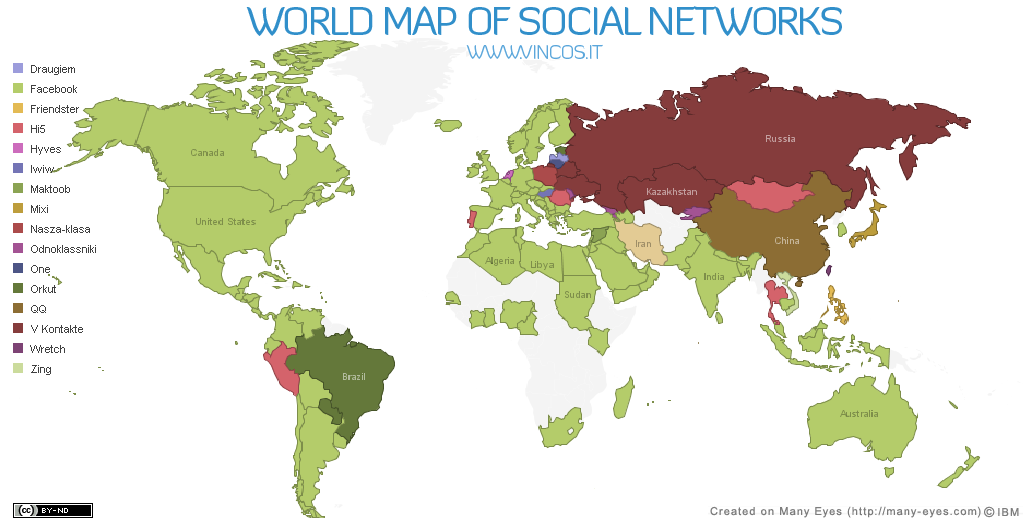
This map was derived from data gathered by Alexa and Google regarding worldwide website usage. This map shows the most popular online social networking sites by nation. I thought this map was interesting because it shows how much Facebook is now used around the world. I also think it's rather interesting how China has its own internal social network and that Russia and surrounding areas have adhered to their original russian networking sites. It will be interesting to watch how these major social networking patterns evolve around the globe.


This map is a representation of the US Interstate system presented like maps of the London Underground transit network. I like it because it represents these interstates merely as pathways across the country, disregarding geographic details. The extreme simplification of this transportation network clarifies it in a peculiarly efficient way.

[la+parks+health+map.bmp]

This map suggests a relationship between park density in LA (shades of green) and obesity rates in children (smaller circles indicate lower rates). Its interesting to note that there are several larger circles throughout the regiod regardless of public park density.


This fourth map, taken from googlemaps.com, shows Omaha, Nebraska, with surrounding cities and towns. I think maps like this are interesting because we can see the grid partitioning that went down throughout the Great Plains and Midwest. Even though the city has grown, the streets remain much according to the grid system.